BRANDING CAMPAIGN FOR PUMPLIFE ATHLETIC BRAND. (2023)
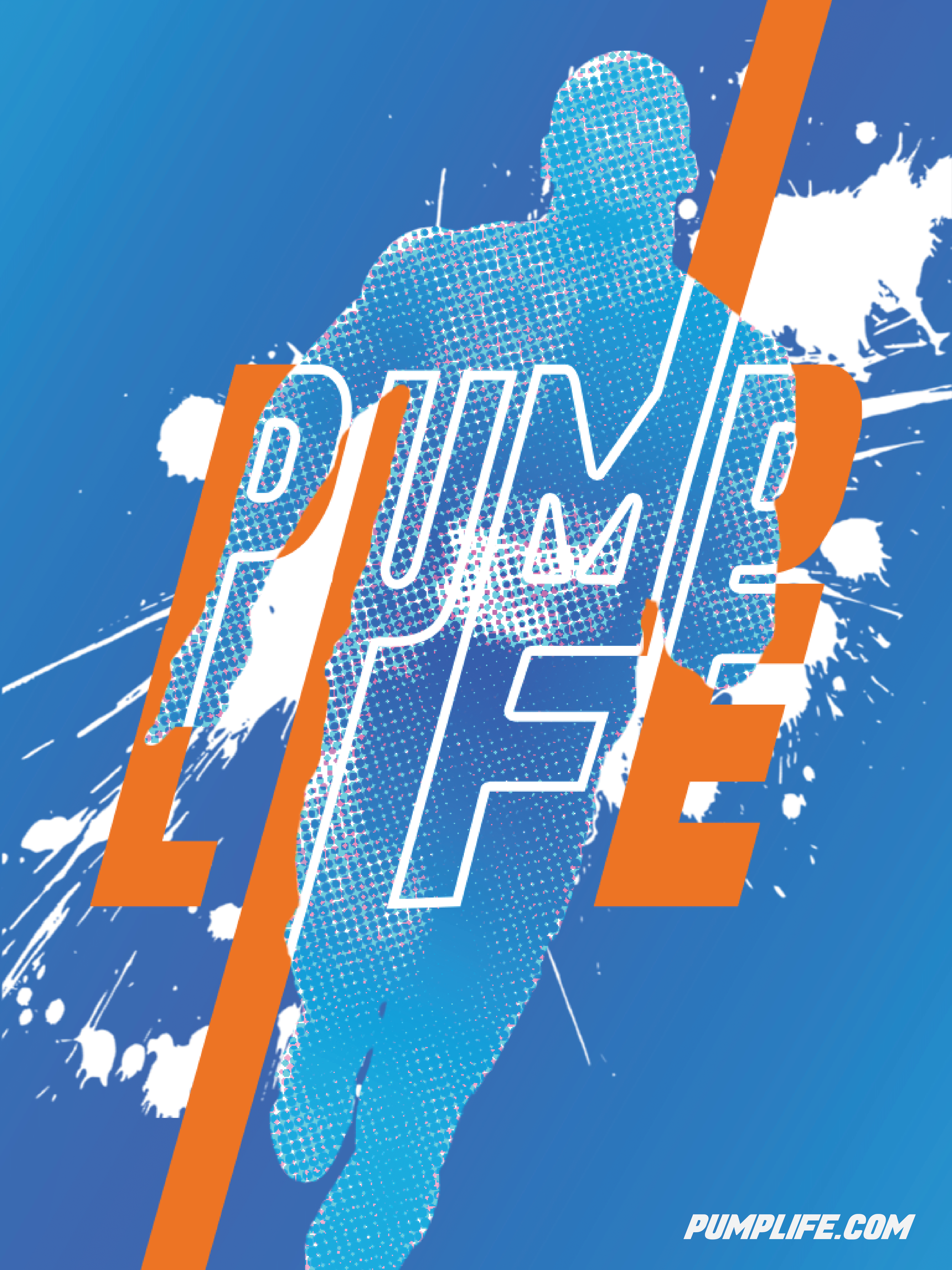
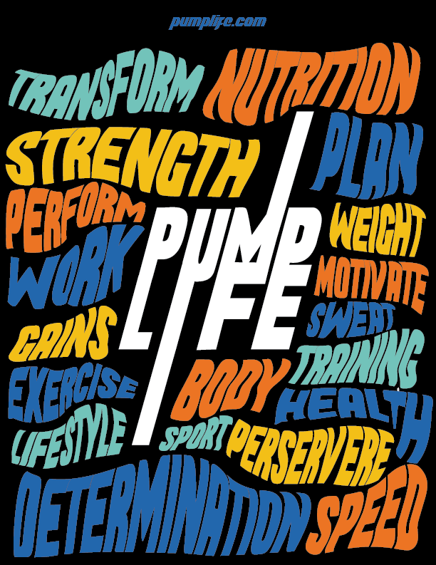
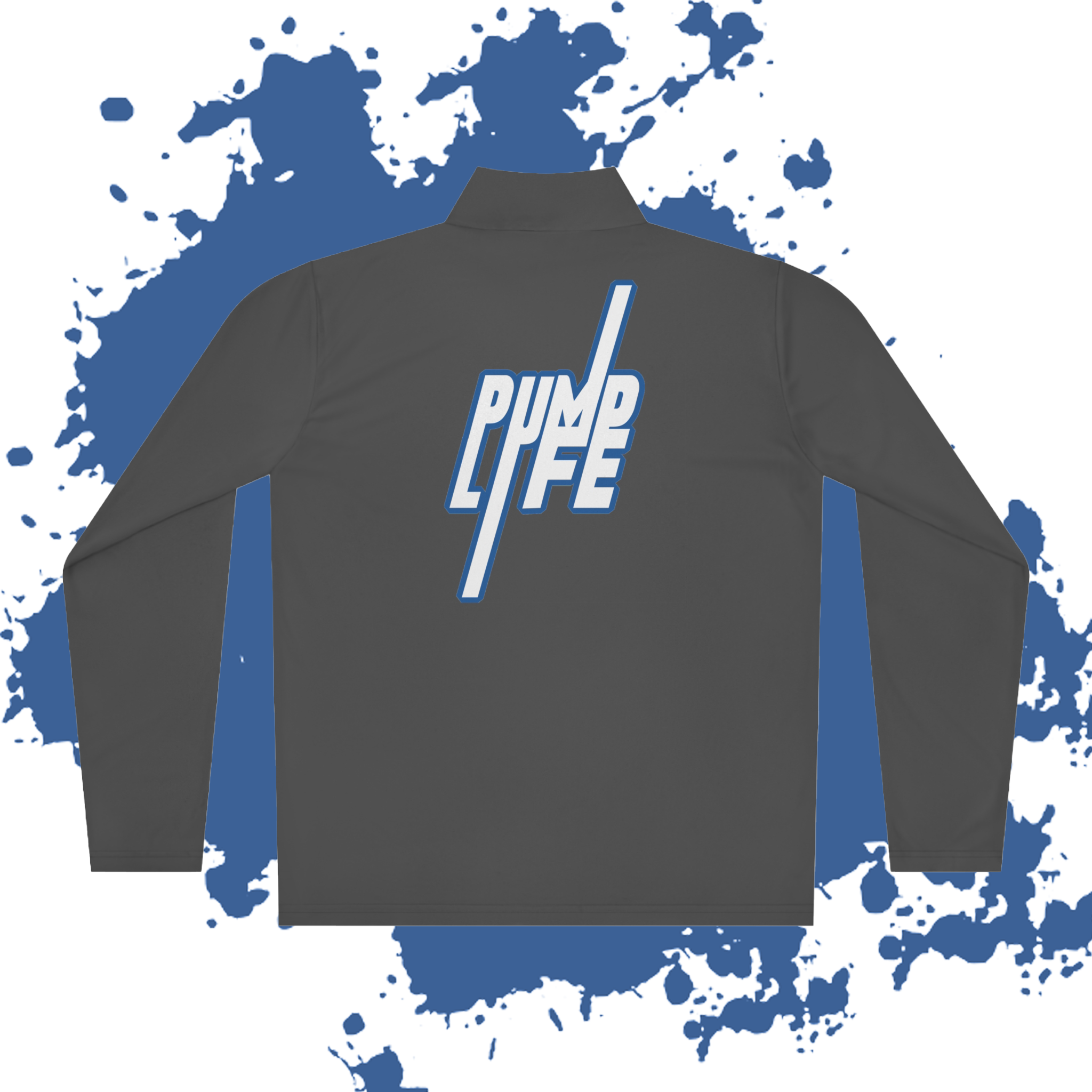
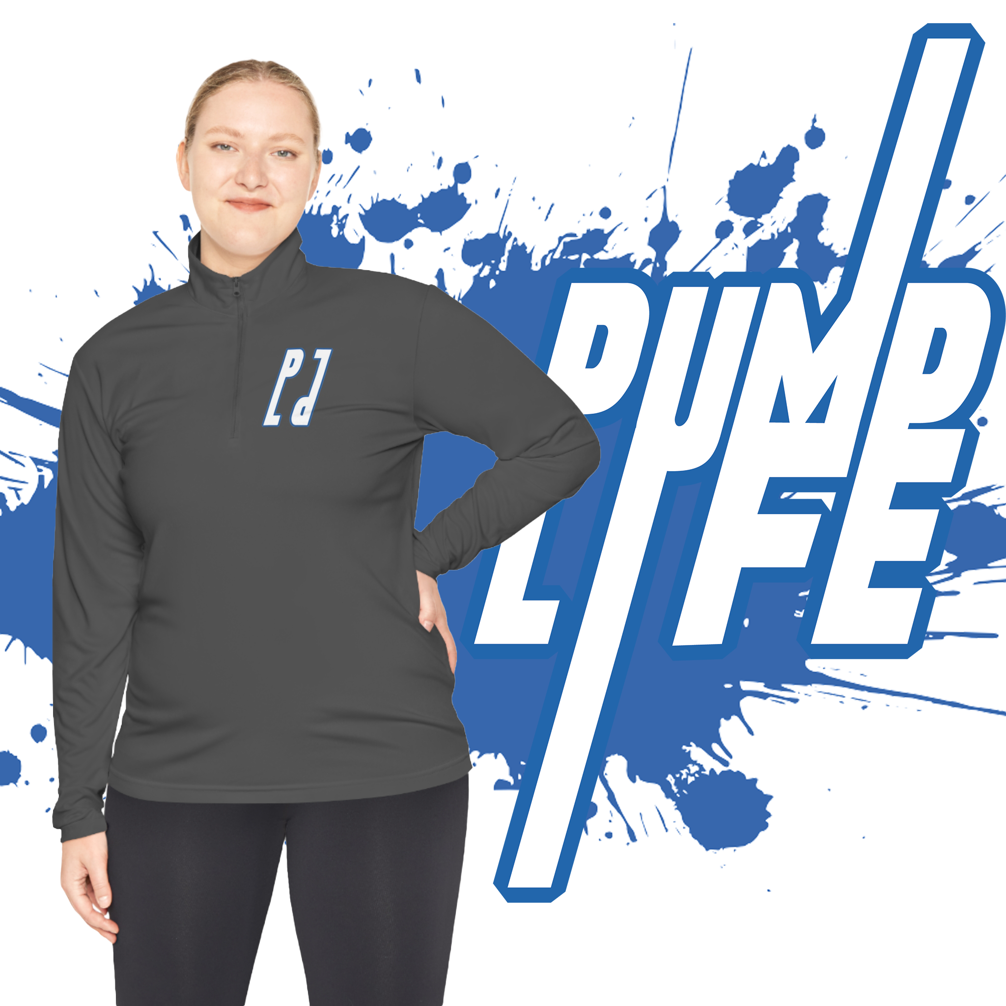
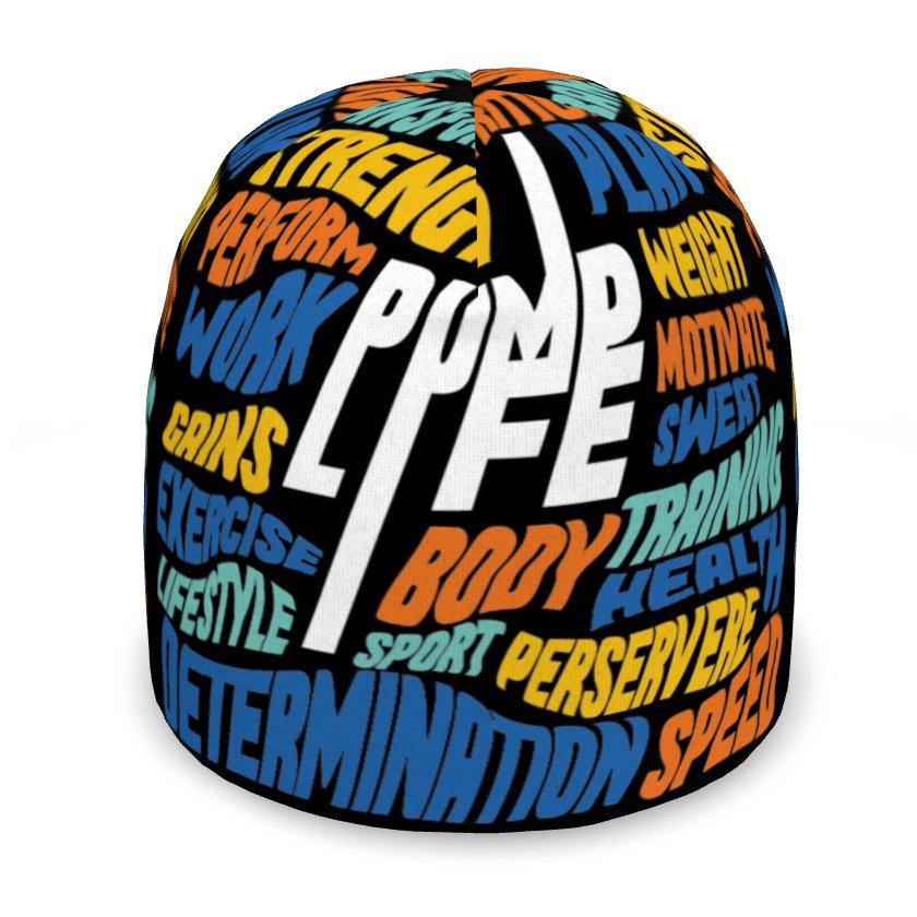
Pumplife was designed to embody motion, youthfulness, and dynamic expression. The brand’s dynamic linework mirrors the forward-leaning stance of runners, serving as the core visual motif. Skewed typography and paint splatters emphasize movement and momentum. The palette blends orange + teal for playful vibrancy, balanced by blue + black for maturity and grounding. The overarching goal was to establish a cohesive, memorable identity for stronger market impact.
Role
• Branding Designer, Motion Designer, Creative Strategist
Tools
• Adobe Illustrator, Adobe After Effects, Adobe Photoshop, Adobe InDesign
Timeline
• 3½ Months
Deliverables
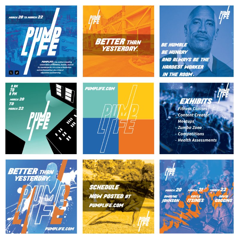
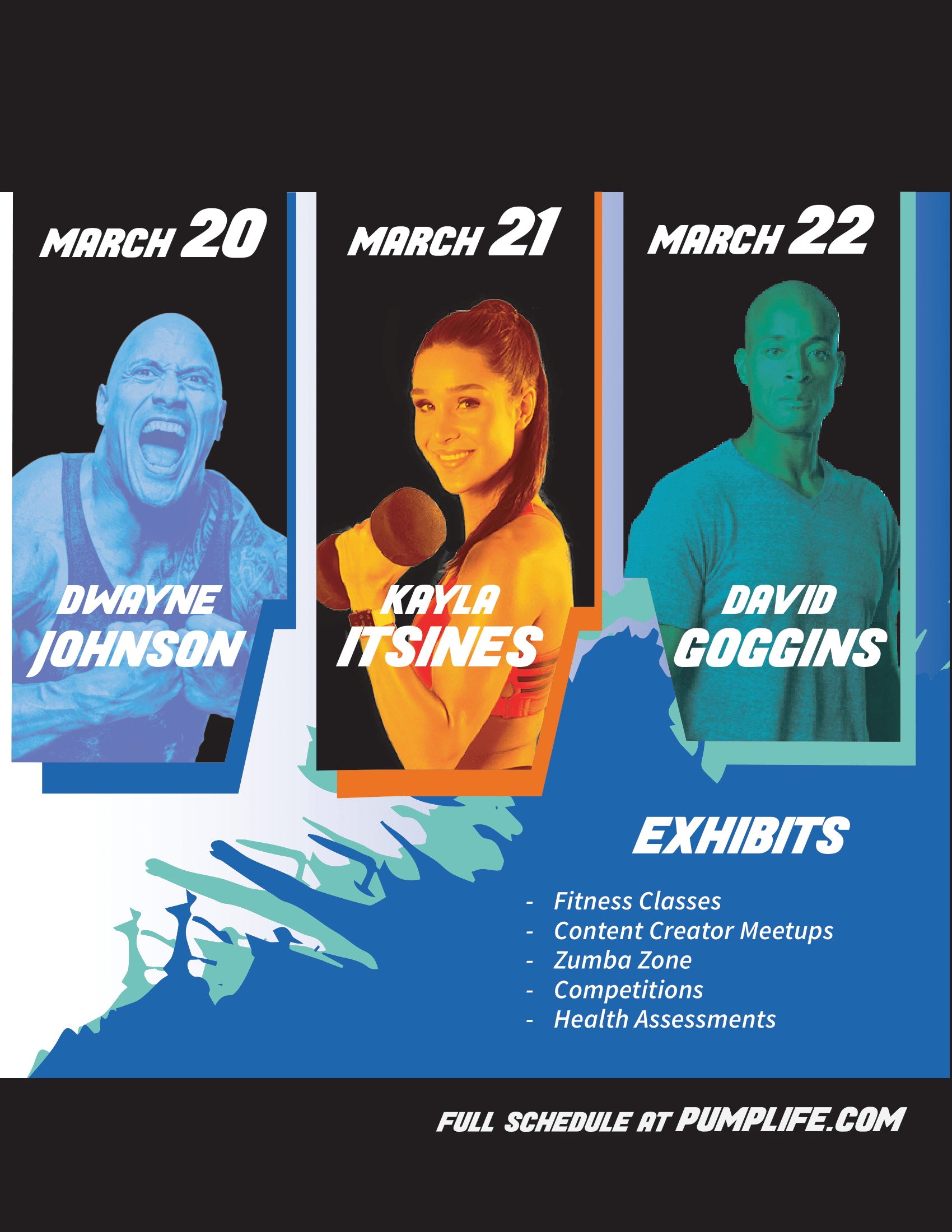
• Branding system & Logo design
• Print materials
• Motion graphics
• Social media assets & advertisements
• Pitch deck & creative strategy
SEE THE PROCESS BELOW. ↓

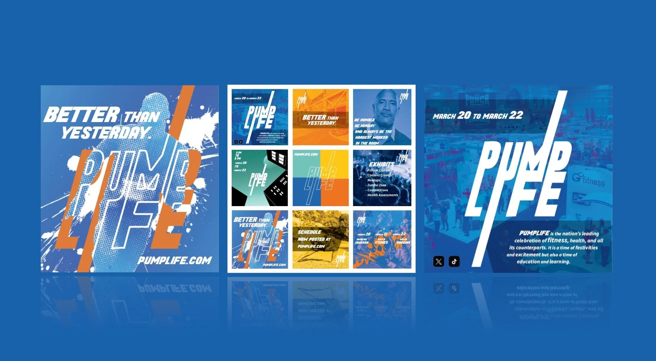
To further develop the initial Pumplife brand, I thought of imagery and graphics that could enforce the idea of movement and energy. I came up with paint splatters and screen tone gradients to tell a young, modern story. After such, I created engaging poster designs which could help round out the brand’s overall direction for future projects.
SEE PRINT & DIGITAL DELIVERABLES BELOW. ↓